Factweavers
An analytics platform you build by talking to your data. Every number shows its work.
Factweavers found me through Dribbble. I had posted chart designs and visualization patterns as a passion project. A few of them travelled, and I got an inquiry to design a charts library that could be themed and would hold up at any resolution. The assignment grew into building the entire application from the ground up, as principal designer, across roughly a year and then a contract renewal.
When I joined, Factweavers was a data platform with a user experience assembled by developers. Dashboards and metrics could be built manually, but it was painful enough that analysts spent their days stitching metrics together instead of analysing anything, non-specialists gave up midway, and executives waited days for a chart.
I reviewed Tableau, Domo, Kyligence, Sigma and PowerBI for feature parity, and in all of them, the road from raw data to a working dashboard takes days to weeks, depending on who’s available and how clean the data is.
The founding bet was that AI could collapse that to minutes. My job was to design the product where that bet could pay off without users having to take the AI’s word for anything.
Three rules
We set three rules and let everything else follow.
- AI must be inspectable, so every generated metric shows how it was calculated.
- Building a dashboard should feel like a checkout flow: structured, previewed, low cognitive load.
- The platform has to serve an executive, an analyst, and a data admin without asking any of them to learn the others’ job.
That last rule came out of persona work. We mapped five user types: analyst, product manager, executive, data admin, and the AI assistant itself, which we treated as a persona with its own obligations (“here’s what I understood, here’s what I can’t yet compute”).
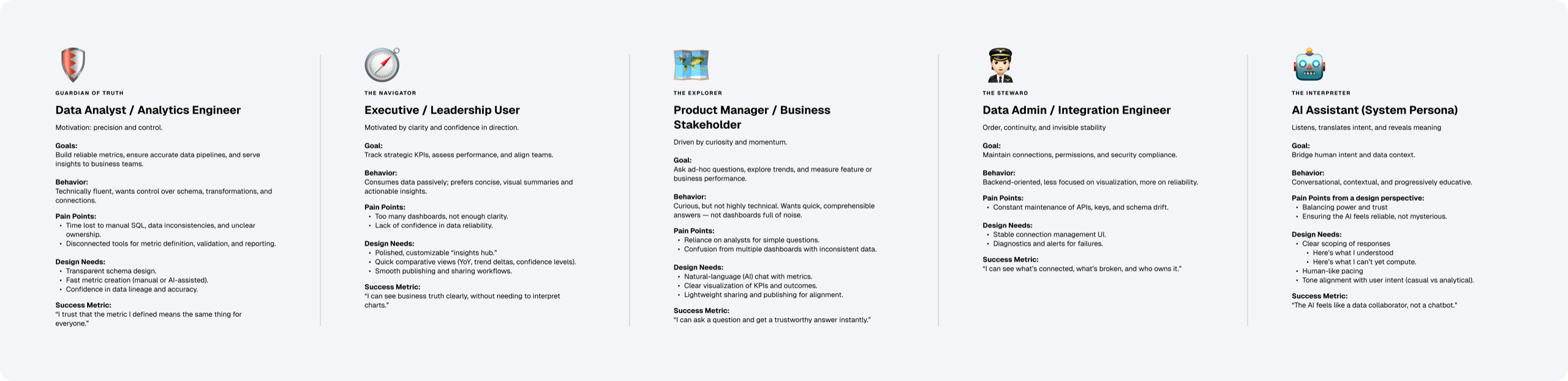
Then we compressed them into two archetypes an interface could actually serve. The Explorer is curious and hypothesis-testing. The Navigator needs clarity, control, and confidence. The information architecture compressed a scatter of screens and modules into one line, onboard → ask, create → ship. We separated schema onboarding to a side quest, a setup that only developers could perform.
An AI that earns trust slowly is more useful than one that borrows it and loses it.
Creating a metric
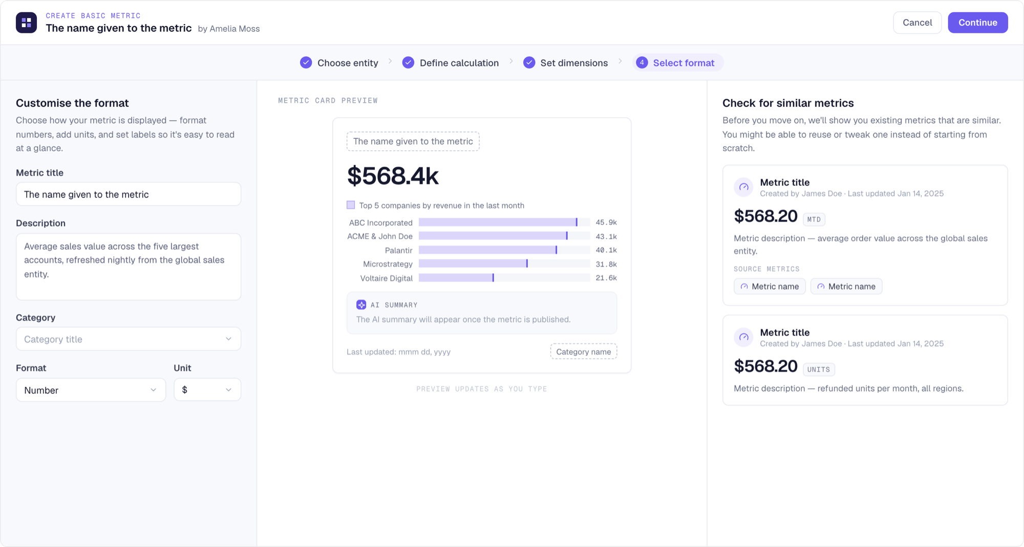
The manual builder was the first thing I built, deliberately. If users were going to trust an AI-generated metric, they needed to be able to open it, see how it worked, pick it apart and edit it by hand. So the manual path had to be intuitive and hard to get wrong.
Metric creation became a 4-step flow: choose the entity, define the calculation, set dimensions, select the display format. Also designed an expression editor that evaluates as you type and previews the result against real data. The final step renders the actual metric card while you name and format it, so what you publish is exactly what your teammates will find.
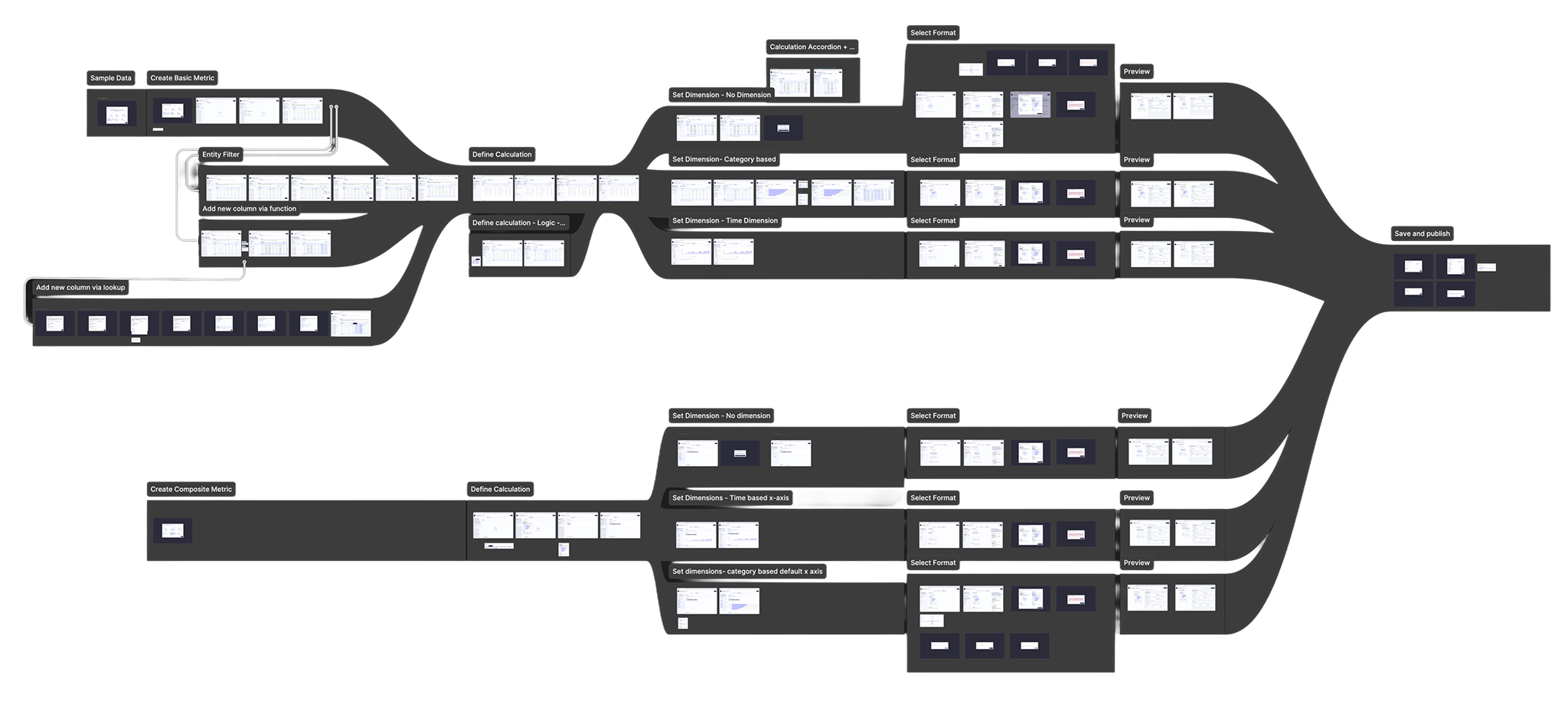
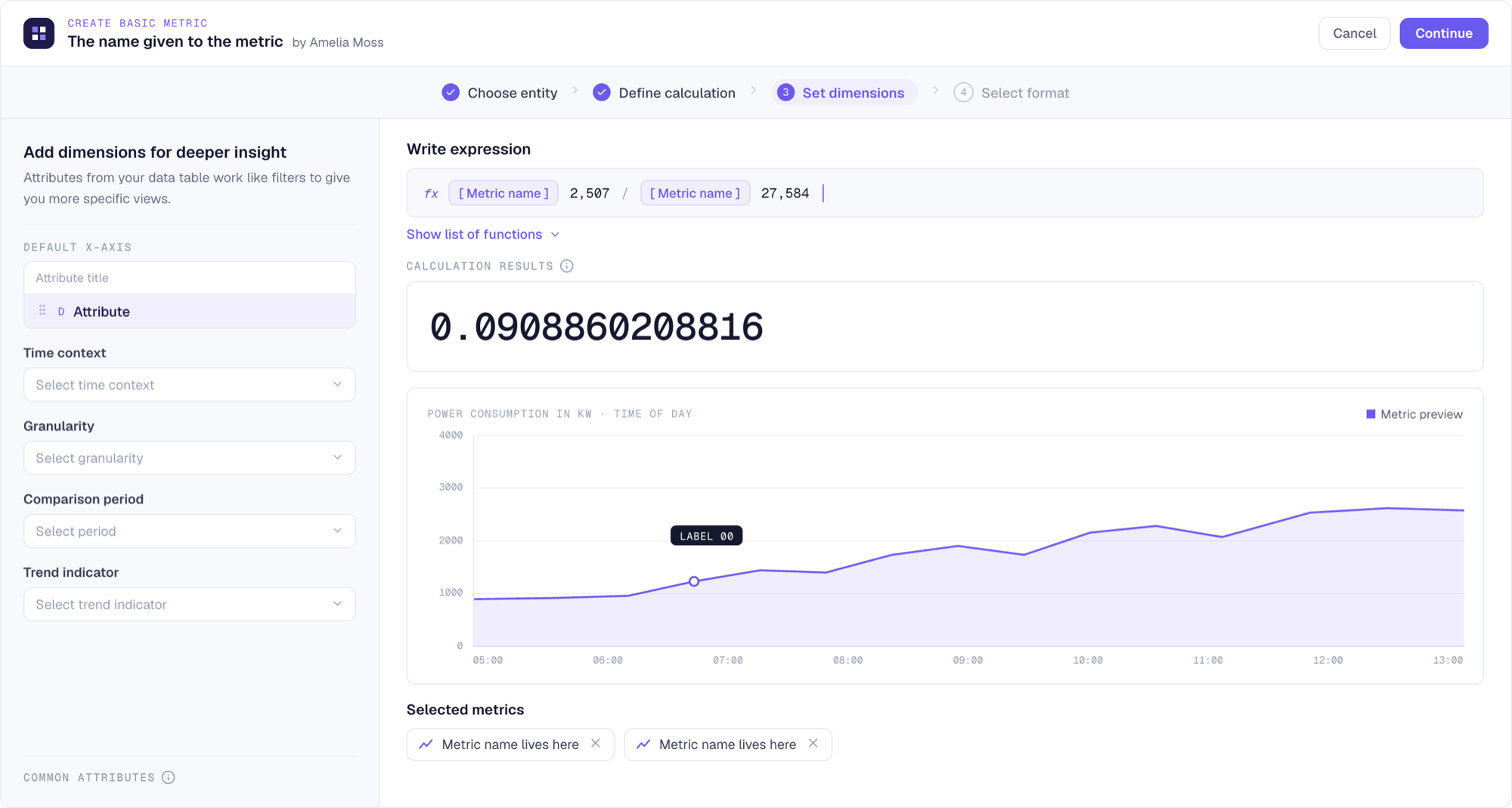
Two details in that flow do the governance. Before a metric is saved, the system surfaces existing metrics that look similar, so a team’s existing revenue KPI gets reused instead of re-invented. Every published metric carries its lineage: the source metrics it was derived from, the calculation itself, who made it and when.
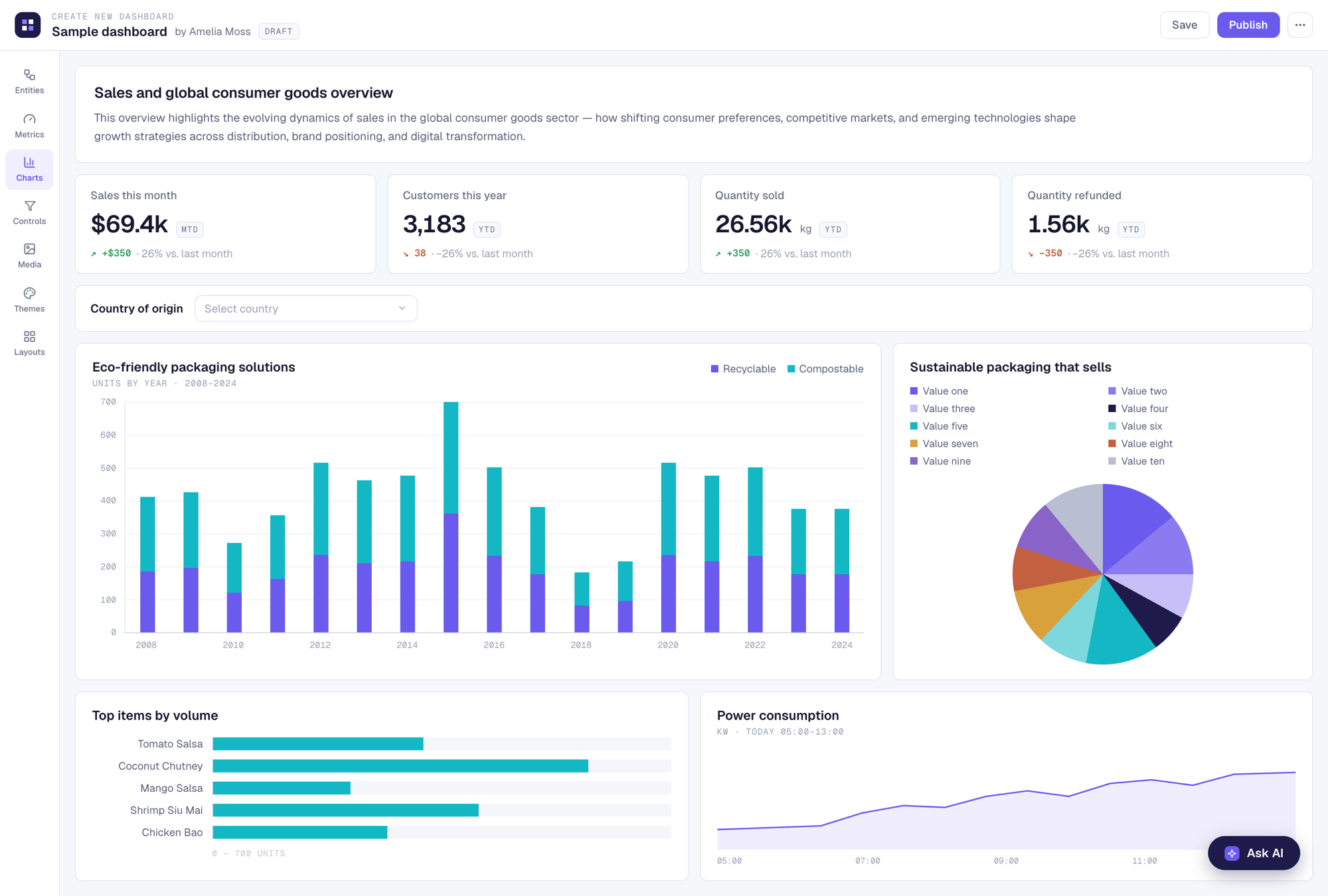
Building a dashboard
The dashboard builder works the way a good checkout does: everything is previewed, everything is reversible. Datasets, metrics, charts, controls, media, themes, and layouts sit in one toolbar, and hovering any metric shows its full card (including source metrics, calculation etc.) before it’s placed on the canvas. Trust accompanies the number instead of living in a wiki.
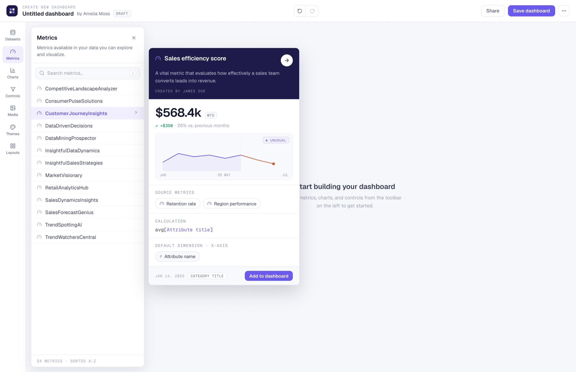
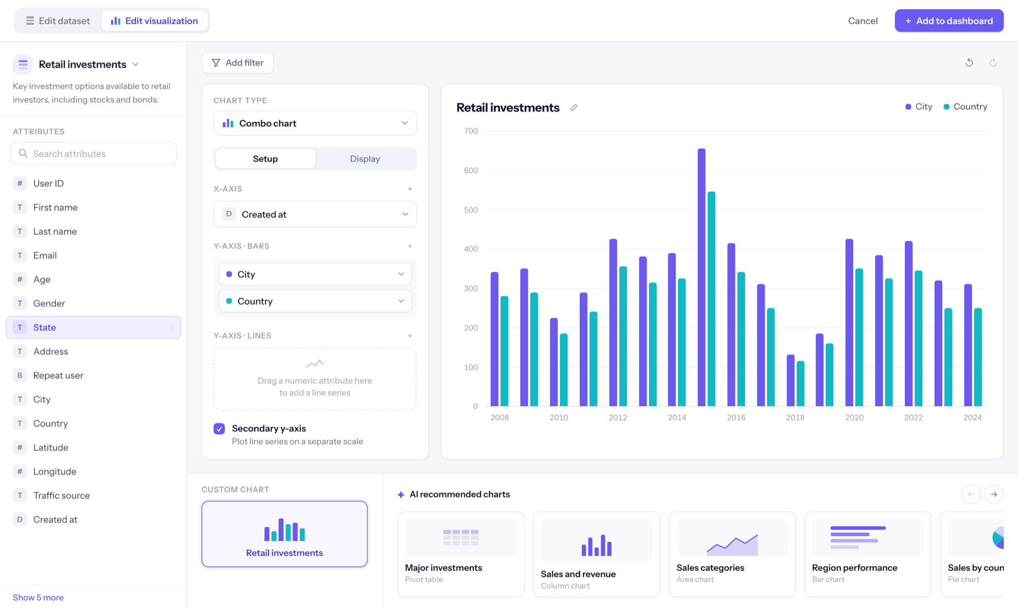
The chart builder keeps the manual and AI-assisted paths in the same editor. You can wire axes and series yourself, or start from an AI-recommended chart and adjust it. Either way you have a full set of controls at all times, so the AI path never becomes a black box.
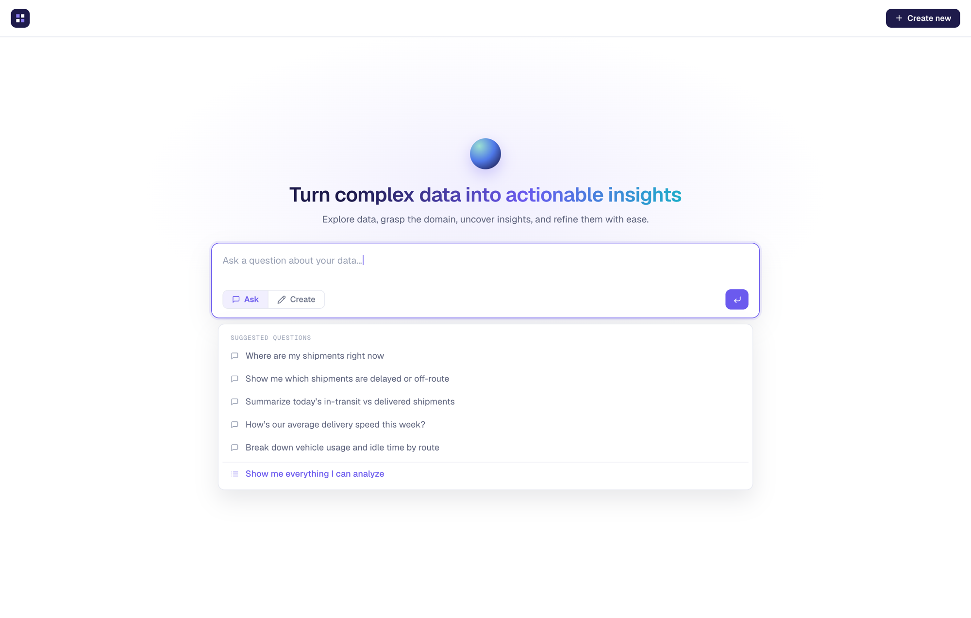
Universal AI
We designed the AI interactions separately at first: create a metric, create a dashboard, have conversations with a metric, have conversations with a dashboard. During user-testing (peer reviews and heuristics, then data scientists and directors in the wider organization, then alpha clients) users kept asking for the same things. They wanted the insight from a saved conversation, turned into a visualization, collected alongside others, and assembled together to tell a story.
This led to the decision that reshaped the product: We hypothesized that everything should start with Universal AI, rather than users starting (or staring) at an empty dashboard.
The users open the product to one conversational surface, with history, search, and session memory, and either have a brief ask or create a full dashboard. From creating a dashboard with AI as an assistant, we finally got to AI at the forefront. The system proposes metrics, charts, and layouts, and each step is refined and confirmed, not accepted purely on faith. Any AI-made chart can be pinned to a dashboard, and any AI-made metric can be opened in the same editor as a hand-built one.
Underneath it is a pattern we called trust scaffolding: confidence indicators, source attribution, and a visible reasoning chain. Engineering wanted to show the output and move on. I pushed the other way, because without the scaffolding, the trust and confidence becomes unknown or disconnected.
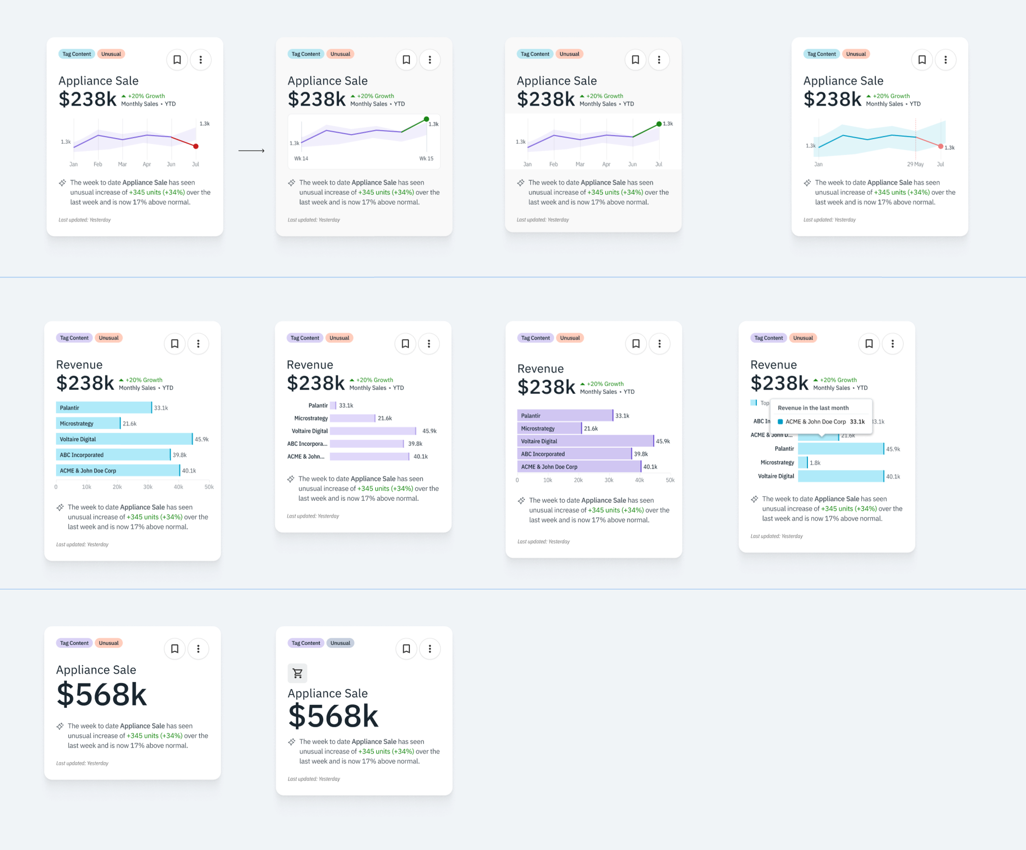
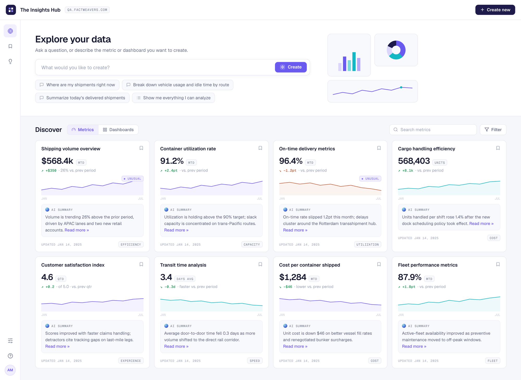
The Insights Hub
The hub is the Navigator persona’s front door. Leadership browses published metrics and dashboards, and every card carries an AI summary in plain sentences (“volume is trending 26% above the prior period, driven by APAC lanes”). Unusual movements are flagged inline rather than discovered later. This screen also carries the Ask interface. Questioning a number or a metric is just a click away.
The design system
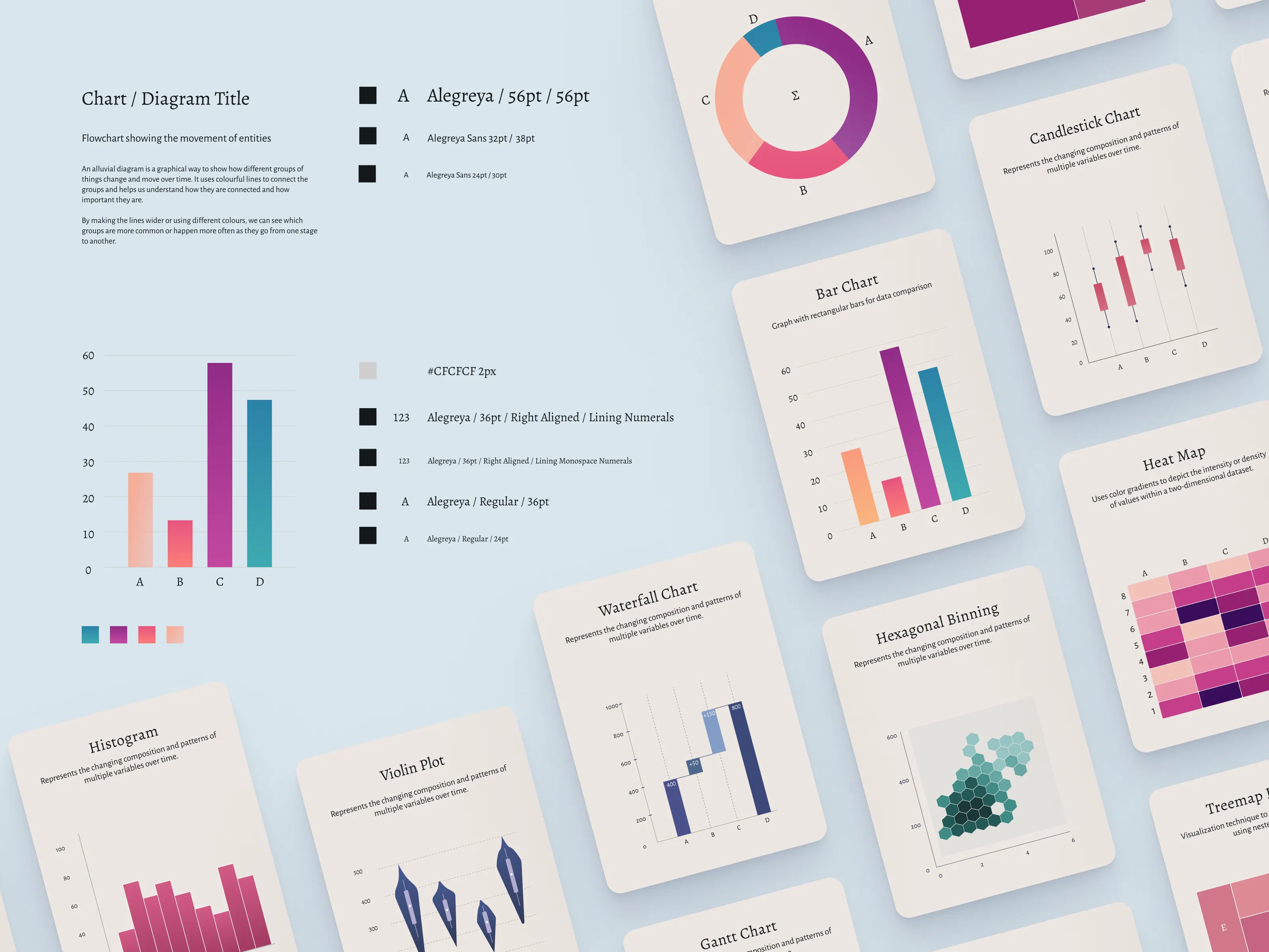
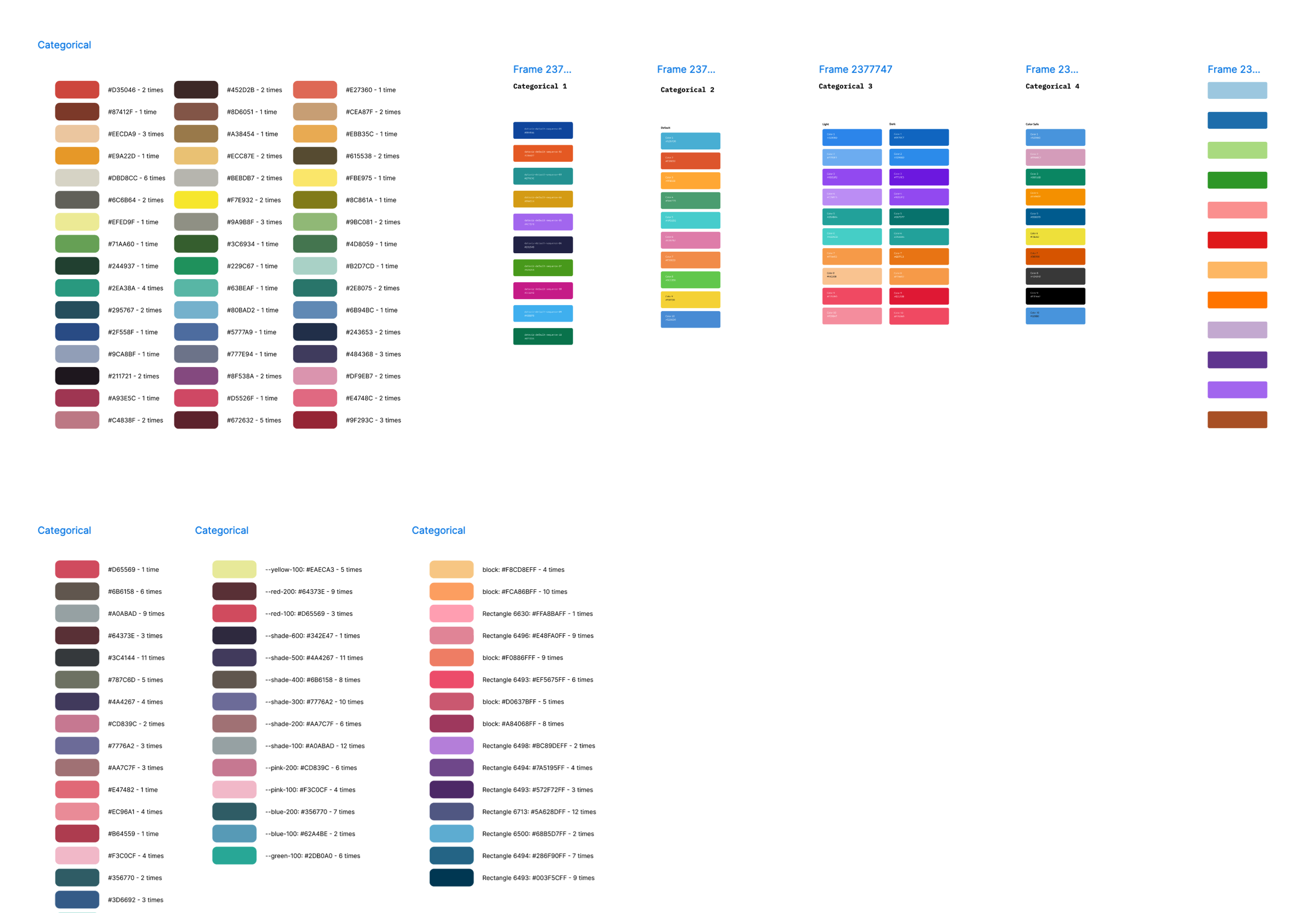
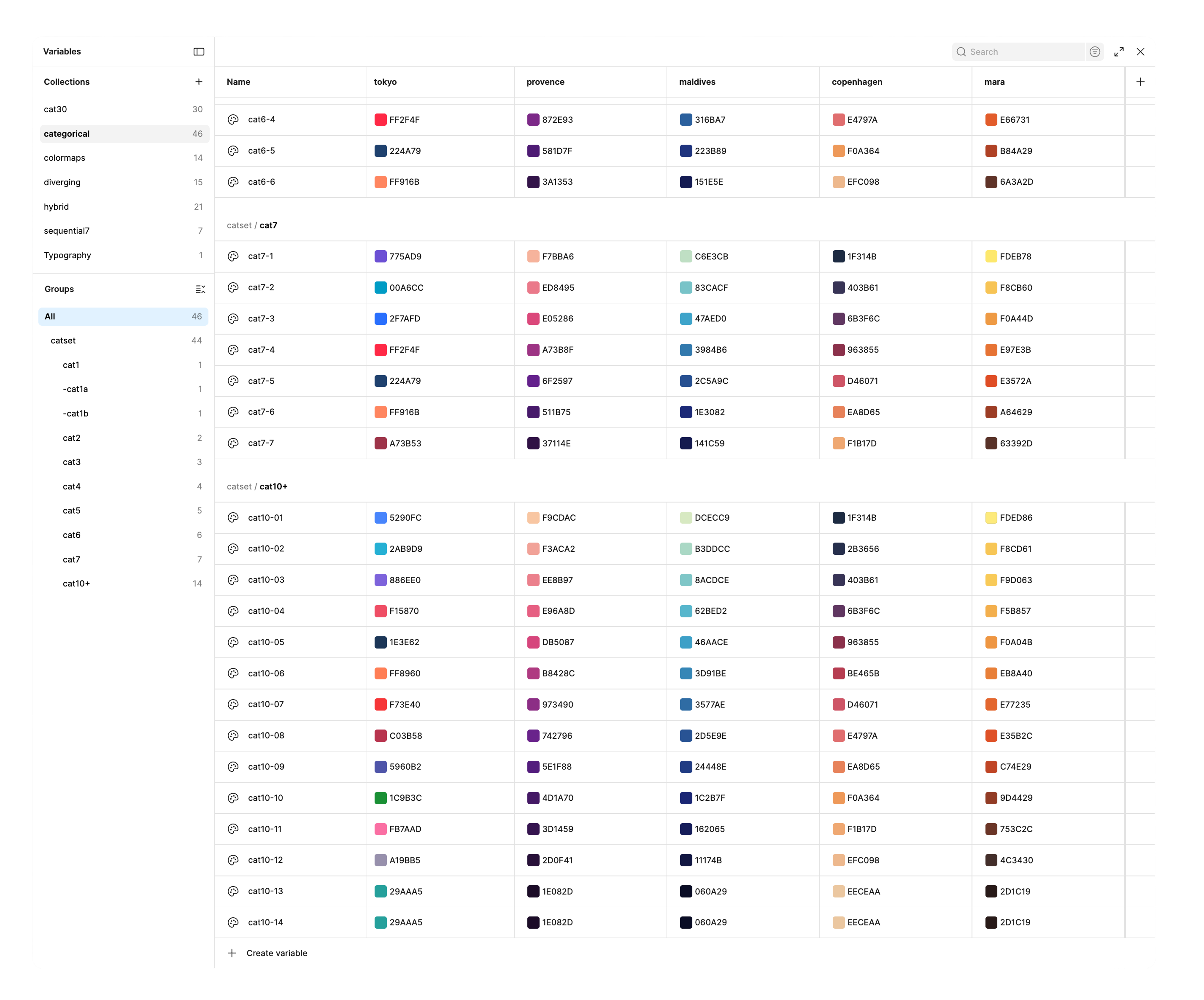
Under all of this sits a design system built on a heavily customised ShadCN base. The complexity compounded because we needed interface color system, for dark and light modes, themes for the share-able dashboard, and on top of all of these, a chart system with usable and accessible color ramps and categorical sets.
- Token architecture for colour, spacing, type, interface chrome
- Theming layer for brand themes in light, dark
- A separate chart sub-system with its own rules.
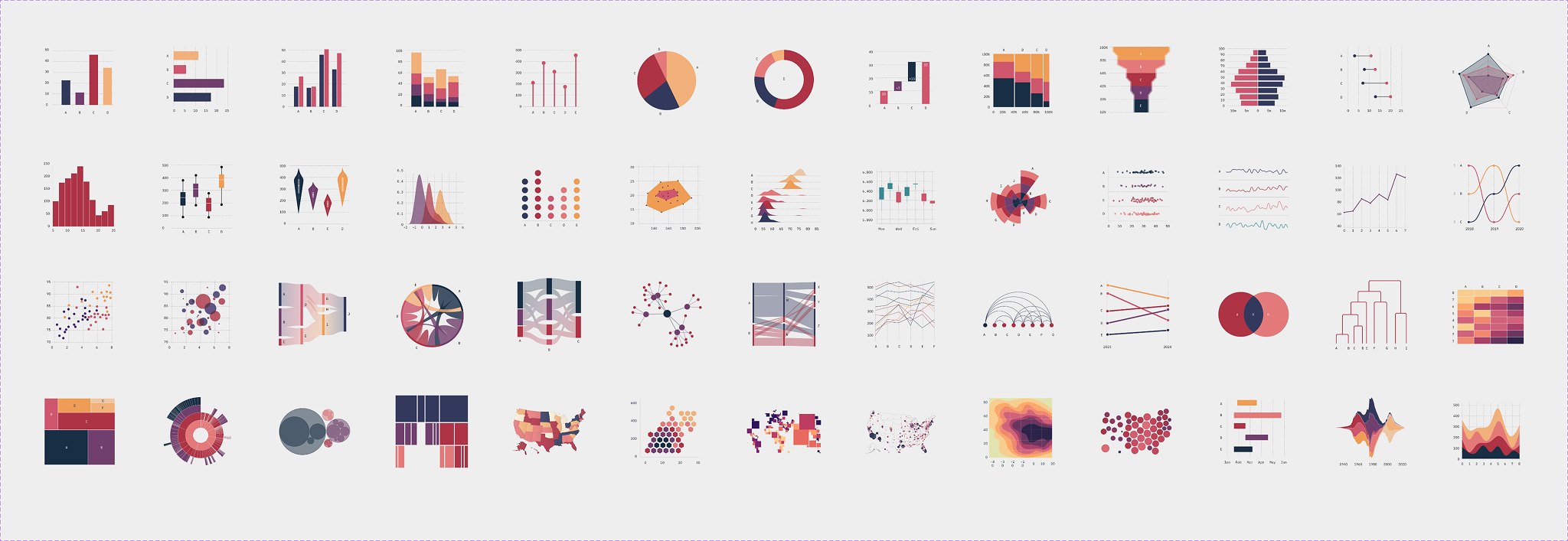
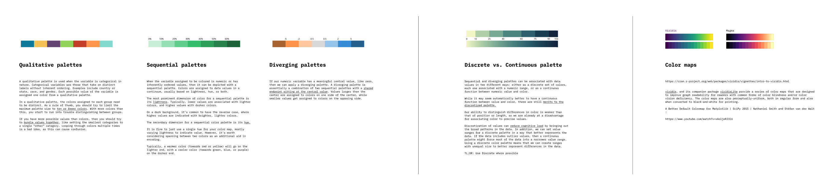
The chart rules were a absolute hard-won and this taught me a ton, on top of what I knew about color systems in chart. Categorical palettes have to keep every colour distinct in hue and lightness, because two colours that sit near each other quietly imply the categories are related, and they have to stay legible across different kinds of colour vision. Sequential and diverging ramps are ordered by lightness. Heatmaps and geographic views use viridis and magma, because those colormaps tell the story without being misread. Since customers theme their dashboards, every one of these rules have to live through a theme change. This was primarily the problem that original charts assignment I was called-in to solve.
My split was roughly 70% hands-on, 30% leadership. I owned the product direction, the key screens, the token and theme architecture, and the chart system, working day to day with the CEO (who was also the lead AI engineer), the product owner, 3X front-end engineers, and 4X QA engineers. In the second half of the engagement I recruited two senior product designers and mentored them. Each of them taking a module like onboarding, the conversational flows, insights hub, shchema onboarding, creating metrics.
The platform is young, so the numbers come from comparative trials and pilot customers rather than a mass market, but they all pointed the same way: A new user following the guided flow ships a dashboard in about 24 minutes, roughly 3.5X faster than the same exercise in PowerBI or Tableau Pulse.
80% of test users said they trusted an AI-generated metric when its explanation was visible, which we hypothesized and designed for. Executives stopped waiting for charts and started building and re-using them, then asking the follow-up question themselves.