TypeStax · 07·2026 · 13 min

I Described a Hardware UI Into Existence

Building a skeuomorphic interface in pure CSS, no reference image, just me telling an AI what I wanted until it was right.

I’ve been writing HTML and CSS since 2004. Around 2016 I moved into UX and product design, and the CSS muscle went a bit soft from there. I still reach for it on personal builds, and I can still get things pixel-perfect when I sit down with it. That part was never the problem. The problem is everything underneath: component architecture, state, data fetching, the wiring that makes an app actually run. I can build the surface of almost anything. I can’t build the machine behind it.

So when I started leaning on AI to write the code, I wanted to know one specific thing. Not whether it could write React, it obviously can. Whether I could steer the part I actually care about, the visual layer, at the precision I’d hold myself to if I were writing the CSS by hand. To find out, I gave myself a rule: build a whole skeuomorphic interface through conversation, with no reference to point at. No Dribbble board, no screenshot folder, no “match this Figma comp.” Just me describing what I wanted, and the AI writing it.

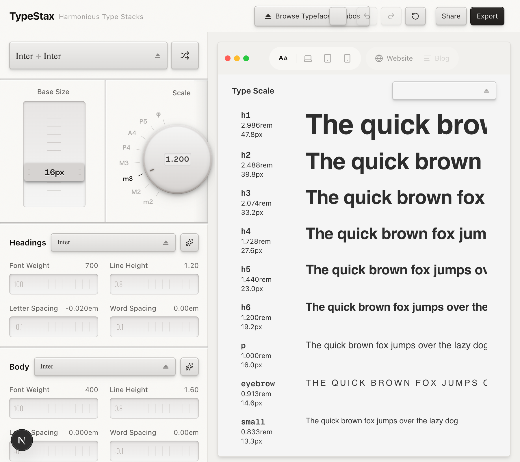
The test case was TypeStax, a typographic scale generator I’d been building. I gave it an industrial hi-fi look. Rotary knobs, embossed slider caps, corner bolts, surface noise, seams between the panels. It ended up looking like rack-mounted studio gear, and every visual decision in it got there through words.

TypeStax. Every knob, bolt, and groove here is CSS and SVG, described out loud and refined in conversation. Not one reference image.

Why do it with no reference?

Because a reference image lets you cheat, and I’d learn nothing. Hand the AI a comp and say “make it look like this,” and it pixel-matches. You never have to say what you actually mean. Take the image away and every decision has to become a sentence. “The shadow is too diffuse.” “The gradient’s going the wrong way.” “This button should sit two millimetres above the panel, lit from straight above.” Turning what my eye catches in half a second into words specific enough to act on, fast enough that the back-and-forth doesn’t kill the momentum. That was the whole thing I wanted to practice.

And when I say “make this feel like hardware,” the AI gives me something. It’s usually fine. Competent, and wrong in ways I can see instantly but can’t fix myself, because the styling is tangled through JSX and Tailwind utilities and state I don’t write. So I describe the fix and trust it to land. Getting good at that description is the skill. Everything below is what it taught me.

The surface everything sits on

The foundation is a noise overlay on every panel, header, and dialog. Without it the gradients and shadows read as digital. With it they read as brushed plastic.

.surface-noise::before {
  content: "";
  position: absolute;
  inset: 0;
  pointer-events: none;
  opacity: 0.4;
  mix-blend-mode: overlay;
  background-image: url("data:image/svg+xml,...");
  background-size: 256px 256px;
}

It’s an inline SVG using feTurbulence, fractal noise at baseFrequency="0.9", applied as a pseudo-element so it can’t interfere with clicks. The mix-blend-mode: overlay is the part that matters. It lays texture over the colors without muddying them. At 0.4 opacity you feel it more than you see it.

One gotcha cost me an hour: position: relative on the parent, which the pseudo-element needs, quietly breaks position: fixed on child dialogs and popovers. The fix was a z-index: 2 on every interactive child. Small, invisible, annoying.

The noise overlay. On its own it's nothing. Under the gradients it's the difference between a screen and a surface.

Talking in physics, not vibes

Here’s the first thing that actually changed my output. “Make it premium” gets you nothing. “Recessed channel lit from above” gets you the right shadows, because it maps to something concrete: an inset box-shadow on the top edge. I think in materials, light, and weight. The AI thinks in CSS properties. Physical description is the bridge between the two.

Take the seams between panels. Real hardware has a line where two modules bolt together, so I asked for a 3px channel pressed into the surface, lit from above.

.module-groove {
  height: 3px;
  background: linear-gradient(to bottom,
    oklch(0.85 0.003 80) 0%,
    oklch(0.96 0.003 80) 100%
  );
  box-shadow:
    inset 0 1px 2px oklch(0 0 0 / 12%),
    0 1px 0 oklch(1 0 0 / 50%);
}

The gradient goes dark to light top to bottom, so it reads as a recess lit from above. The inset shadow deepens the top of the channel. The bright hairline below is the light catching its bottom lip. Together they read as a seam. Once I described it that way, I could ask for “a module groove between these sections” and get it in one shot. The metaphor was the spec.

Module grooves. A 3px gradient with opposing shadows reads as a physical seam pressed into the panel.

Naming things so I could stop explaining them

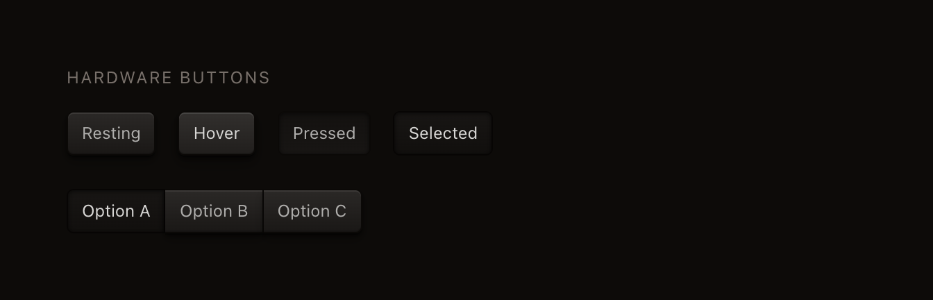
The buttons taught me the second lesson. The .hw-btn class is the most reused thing in the app, and getting its four states right, resting, hover, pressed, selected, mattered more than any single flourish.

The resting button stacks five shadows: three drop shadows at growing blur for depth without a hard edge, plus a white inset highlight on the top lip and a dark inset line on the bottom. The gradient only shifts 6% in lightness, just enough to read as convex instead of flat. The interesting one is the pressed state:

.hw-btn:active {
  background: linear-gradient(180deg,
    oklch(0.88 0.003 80) 0%,
    oklch(0.90 0.003 80) 100%
  );
  box-shadow:
    inset 0 1px 3px oklch(0 0 0 / 12%),
    inset 0 0 1px oklch(0 0 0 / 8%);
}

The gradient flips. Lighter on top when it’s raised, darker on top when it’s pushed in, because a button’s curvature actually reverses when you press it. The drop shadows vanish and inset shadows take their place. It stops sitting above the surface and gets pushed into it.

Somewhere around here I started giving everything names. Module grooves. Hardware buttons. Bolt corners. The moment I did, the AI locked onto them and stayed consistent. “Add a module groove here” carried zero ambiguity. We were building a design system out of vocabulary, and it’s the single most useful thing I did the whole time. If you do any sustained visual work this way, name your patterns on day one.

The four button states. Resting sits above the panel; pressed and selected get pushed into it. Same class, different shadow logic.

The sliders, and one variable at a time

The sliders are a recessed track with a raised cap, same lighting logic as everything else. The detail I liked most is the value stamped into each thumb, engraved rather than printed:

.slider-embossed-text {
  text-shadow:
    0 1px 0 rgba(255, 255, 255, 0.8),
    0 -1px 0 rgba(0, 0, 0, 0.05);
}

The white shadow below the text is the trick. It’s the light catching the bottom of an engraved letter, while the faint dark shadow above is the letter casting into the groove. Read together they press the text into the cap.

Getting the track right, though, is where I learned to slow down. I’d look at a slider, decide “that needs to be darker,” say exactly that, and it would still look wrong after. Because darkness wasn’t the problem. It was contrast against the track, or warmth against the panel, or tick marks at 50% opacity fighting the thumb for attention. I had to stop naming the feeling and start naming the fault. “The thumb should be darker than the track but not as dark as the panel border” is a prompt that works. “Darker” is a wish.

And I could only ever change one thing per round. This goes against every instinct I have, because I see all the problems at once and want to fix them in one pass. But change three things and you can’t tell which one helped. So it’s “darker thumb,” then “quieter ticks,” then “softer shadow,” in sequence. Painfully slow, and it converges every time. Whenever I tried to batch three fixes I went in circles for twenty minutes.

The slider. Embossed value on the cap, and when you drag to the end of its travel the thumb flashes amber, like an overload LED on a mixing desk.

The knob I had to build wrong first

The scale-ratio selector became a rotary knob, and it’s the piece that taught me the most, mostly by wasting my time first.

A dropdown for eight scale ratios is fine and forgettable. A knob turns the choice into a gesture. You drag or scroll, it rotates, a little mechanical counter in the middle rolls the digits into place. It makes changing the ratio feel like it matters, which it does, since the gap between a Minor Third and a Perfect Fifth rebuilds the entire type hierarchy.

I started ambitious. The knob had 48 grip ridges around the rim, built from a conic gradient alternating two colors every 7.5 degrees, and a brushed-metal face with its own conic gradient and a specular highlight. In isolation it looked genuinely metallic. I was pleased with it for about a day.

Then I put it next to the flat buttons and the plain sliders, and it looked like it had wandered in from a different app. All of it got deleted. The final knob is flat gradients with the depth coming entirely from layered shadows.

What I threw away. 48 grip ridges, brushed-metal conic gradient, a specular highlight. Impressive alone, wrong in context.

For a while I called this a “keep it simple” lesson, and that’s not quite it. The final knob still stacks layered box-shadows and gradients. The real lesson is that skeuomorphism works when the detail serves the interaction, not when it serves the render. And I couldn’t have reasoned my way to the clean version. I had to see the overwrought one to understand where the line was.

That reframed how I work with the AI entirely. A version that would cost a human collaborator a day of effort costs the AI two minutes, so overshooting is cheap. Now I ask for too much on purpose, look at it, and cut back. The bad version isn’t waste. It’s the thing that shows me what I actually want.

The knob I kept. Same component, flat gradients, shadow depth only, with a rolling odometer counter in the middle.

The counter was pure indulgence. Each digit is a column of 0–9 in a clipped window, and changing the value translates the column with a weighted easing curve (cubic-bezier(0.23, 1, 0.32, 1)) so the digits settle like a real wheel. The decimal point gets its own static element, because a rolling decimal looks wrong. Real odometers don’t roll their dots.

The details nobody asked for

Every panel and dropdown carries four corner bolts, 6px circles built from a radial gradient offset to the upper-left so each screw head domes toward the light. Are they necessary? No. Do they sell the whole “mounted hardware” idea? Completely. Four bolts, four corners, every dialog, every time.

Corner bolts. A radial gradient with the highlight offset to the upper-left gives each 6px screw head a dome. On every panel in the app.

Every dropdown trigger uses a custom eject icon instead of a chevron, the triangle-over-a-bar from tape decks and CD players. When you customize a specific element’s line-height, a tiny amber dot lights up on its tab, like an LED on a hardware panel telling you which channels are hot. None of it is load-bearing. All of it is why nobody opens the thing and thinks “oh, another one of these.”

The LED override dots. When an element has a custom value, its tab lights up, so you can see at a glance what you've touched.

The meters that tell you when you’re wrong

The last thing I added is the one I’m fondest of. TypeStax checks the contrast between your text colors and the background, and a contrast ratio is just a number. I could have printed “4.2:1” in a label and moved on. Instead it’s a pair of analog VU meters sitting above the color pickers, needles swinging on an arc, because a needle tells you the magnitude before you’ve read anything. You see it parked in the red and you know the colors are wrong. It also happens to be exactly what studio gear looks like, so it belonged here anyway.

The needle runs on a spring, not a transition. There’s a little simulation looping on requestAnimationFrame with stiffness, damping, and mass, and the whole feel comes out of two lines:

const force = stiffness * (target - current)
const dampForce = -damping * velocity

When the target contrast changes, the needle doesn’t slide to the new value. It overshoots, wobbles, and settles, the way a real meter does. Hit the swap button that flips foreground and background, and I kick the needle with a velocity of -600 first, so it slams down toward zero before the spring drags it up to the new reading. It looks like you tapped the glass. The heading meter marks everything below 3:1 in red, the body meter below 4.5:1, and an amber LED in the corner blinks slow when you’re under the line and faster when you’re well under it. Different WCAG thresholds for different text, spoken in the meter’s own language instead of a warning label.

I don’t have a clean screenshot of the meters in motion, which is the whole point of them, so you’ll have to take my word for the overshoot.

The whole aesthetic is CSS and SVG. No images, no canvas, no WebGL. Box-shadow, linear-gradient, ::before pseudo-elements, and SVG filters. That’s the entire toolkit.

What actually got in the way

I want to be honest about the friction, because it’s the most useful part.

The AI defaults to tasteful and safe. My first prompts for skeuomorphic buttons got me softly rounded rectangles with one drop shadow, the kind of thing you’d see in a ShadCN demo. I had to push hard before it took any risk. Then it overcorrects, and there’s no middle gear. Ask for “more depth” and you get 48 grip ridges and a metallic conic gradient that looks like a 2008 render. Every session had the same rhythm: ask for more, get too much, spend eight prompts dialing it back to right. The dialing back is where the actual design happens, and it’s tedious.

Dark mode broke everything, every single time. I’d spend an hour perfecting light mode, flip the switch, and every thumb turned into a pale ghost floating on a dark track, every tick mark screamed, the knob’s warm grays went muddy. It needs its own contrast relationships, its own shadow intensities, its own hierarchy, tuned element by element. I paid for forgetting that more than once.

Same buttons, both modes. Dark mode isn't the light palette flipped. It's a separate set of contrast decisions made from scratch.

Long sessions rot. Forty prompts into refining a component, the AI would start contradicting things we’d settled early, re-adding a border I’d removed or reaching for rgba when we’d agreed on OKLCH. The old decisions don’t get forgotten so much as diluted by everything newer. I learned to front-load the constraints and repeat them: we use OKLCH not rgba, no hard borders only rings, the texture class is surface-noise. Repeating yourself isn’t waste here, it’s maintenance.

Motion was the one I couldn’t get a grip on. I can picture an easing curve in my head, I know what weight I want a movement to carry, but “the counter digits should decelerate like they’ve got mass” comes back as cubic-bezier(0.23, 1, 0.32, 1) and I have no way to judge it until I watch it run. Anything visual, I glance at the browser and know in a second. Motion is a slower loop: play it, decide, adjust, play it again. The VU needle and the knob counter each took a dozen rounds of that, because guessing at numbers I can’t read is the only move available to me.

And it never pushes back. If I’d said “add a lens flare to the knob,” it would have added a lens flare to the knob. A human collaborator raises an eyebrow. The AI just executes, so all the taste filtering falls on me, in real time, while I’m also trying to articulate the next change and evaluate the last one. That’s the genuinely tiring part.

What carried over

The CSS tricks are specific to this build. The rest of it isn’t, and it’s the part I keep using.

I can see something is wrong far faster than I can say why. Half a second to feel it, two minutes to explain it. That gap is the actual bottleneck, not the AI’s ability and not the tooling. It’s my ability to take a thing I can feel and turn it into words another party can act on. That shows up anywhere you know what you want and someone else has to build it.

Nouns beat adjectives. “More refined” is a guess with a coin flip attached. “Add a 1px inset highlight on the top edge” is a result. I kept slipping into adjectives because that’s how I talk to other designers, who share my references. The AI doesn’t, so it needs the noun and the property.

The other thing that fixed my prompts was describing relationships instead of values. “Make the thumb stone-500” means nothing to me, I don’t think in Tailwind shade numbers, and I can’t tell if it’s right without rendering it. “The thumb should be darker than the track and lighter than the panel edge” I can check by looking. The AI turns a relationship into an absolute value far better than I can pick the absolute value blind, and the relationship is the thing I actually hold in my head.

Name the relationship, not the element. When the knob looked wrong next to the buttons, my reflex was to call it “too much” and try to make it cleaner. But the knob wasn’t the problem, the mismatch was. It had more visual weight than everything around it, and “cleaner” doesn’t say that. “This element is louder than its neighbors” does, and it points at the actual fix, which might be quieting the knob or bringing the buttons up to meet it. I spent years giving feedback on individual elements. The more useful habit turned out to be naming how they sit next to each other.

And the fluency compounds, which surprised me. On day one I was saying “make the button look more like a real button” and hoping. By day eight I was saying “add a 3px inset shadow at 12% opacity on the top edge to match the groove depth.” Same person, same taste, completely different vocabulary. Every word I’d defined earlier made the next request faster, until I could describe a whole new component in one sentence and land most of it, because each term already mapped to a pattern we’d built. It’s a real skill with a real learning curve, steeper than I expected going in.

Twenty years of CSS got more useful, not less. I’ve never stacked five box-shadows on one element or run mix-blend-mode: overlay over a noise texture before this. The AI showed me techniques I knew existed but had never reached for. And because I already understood the medium, I could catch the subtly-wrong version and push for a fifth pass where someone without the background would have accepted the first. The AI handles execution. The judgment about how much depth is enough, when detail turns to clutter, what makes elements feel like they belong together, that’s still mine, and it’s the part that took two decades of looking at interfaces to build.

The full interface. Knobs, meters, grooves, bolts, all of it CSS. Whether it's good product design or self-indulgent craft I honestly can't tell you.

The real unlock for someone with my background isn’t that I learned JavaScript. I still can’t write a Zustand store from scratch. It’s that I can now direct the visual layer at a precision I never had access to, by describing a component once, getting to 80% right, and closing the last 20% in conversation. The AI does the React, the state, the routes, the build. I do the thing I’ve been doing since 2004, which is making it look exactly right.

The knob is satisfying to drag. I described it into existence, and never once pointed at a picture.

Published 07·2026 · 3,081 words · 13 min
All notes